Burn + Bloom
October 2026
custom element system
Where it began
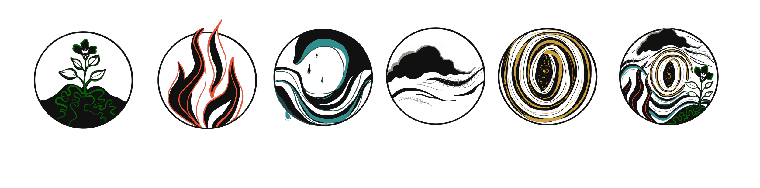
Burn + Bloom already had a set of icons representing the five elements. earth, fire, water, air, and ether. After meeting with AlisaMarie, I started reimagining each one through my own illustration style, along with a sixth design that would bring pieces of all five together.
I started in black and white, focusing first on shape, movement, and the personality of each element before bringing color into the mix. The goal was never for them to match exactly, but to feel like they belonged together.
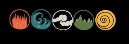
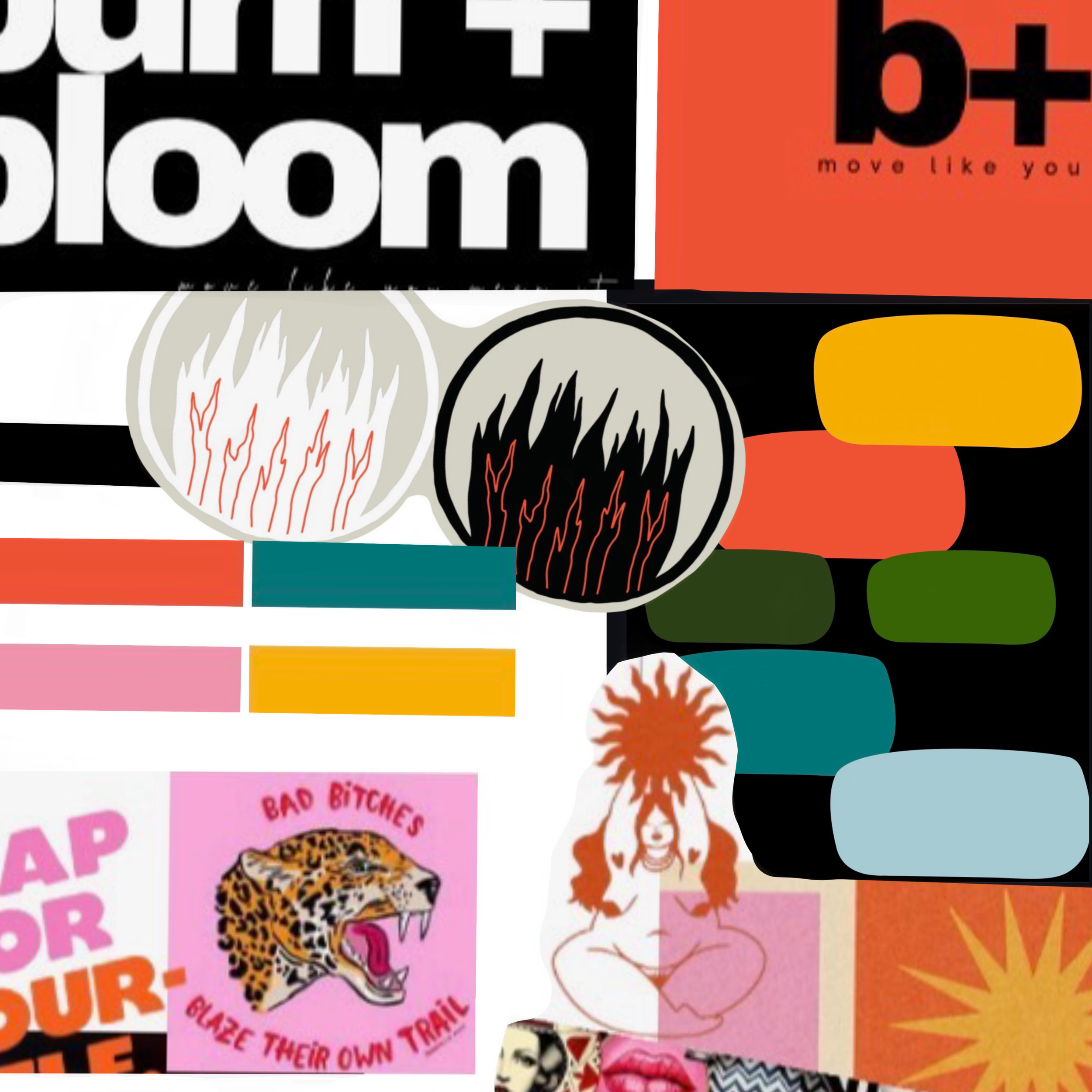
what Burn + Bloom came to me with
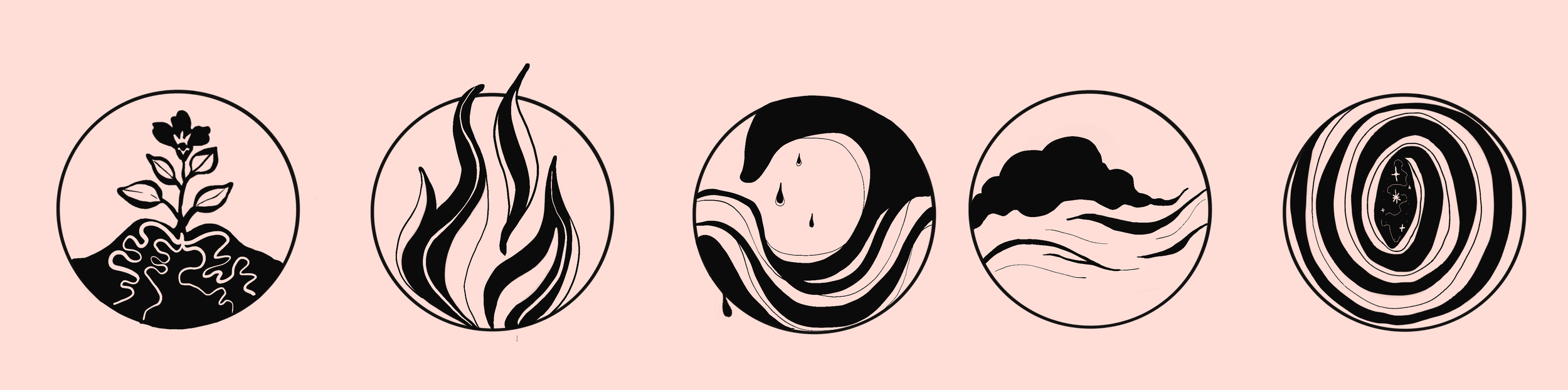
my first pass after our meeting
Bringing in color
Once the forms were in place, we started narrowing in on color. AlisaMarie wanted the palette to feel connected to Burn + Bloom.
From there, I worked each element into its own palette while keeping the full set connected.
color + visual direction
first color pass
Refining the system
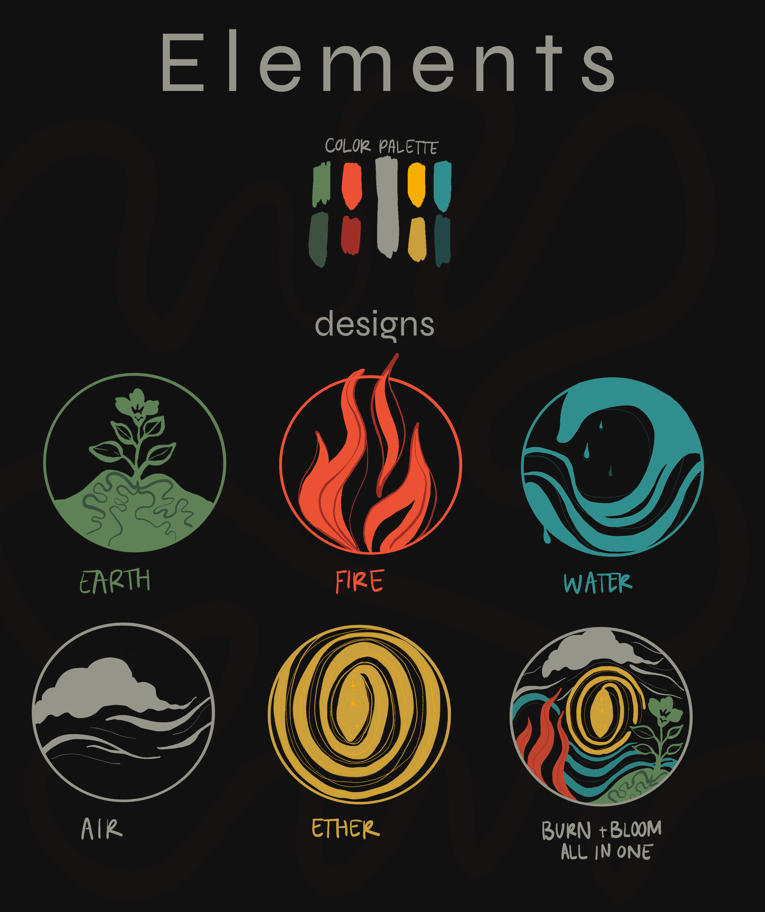
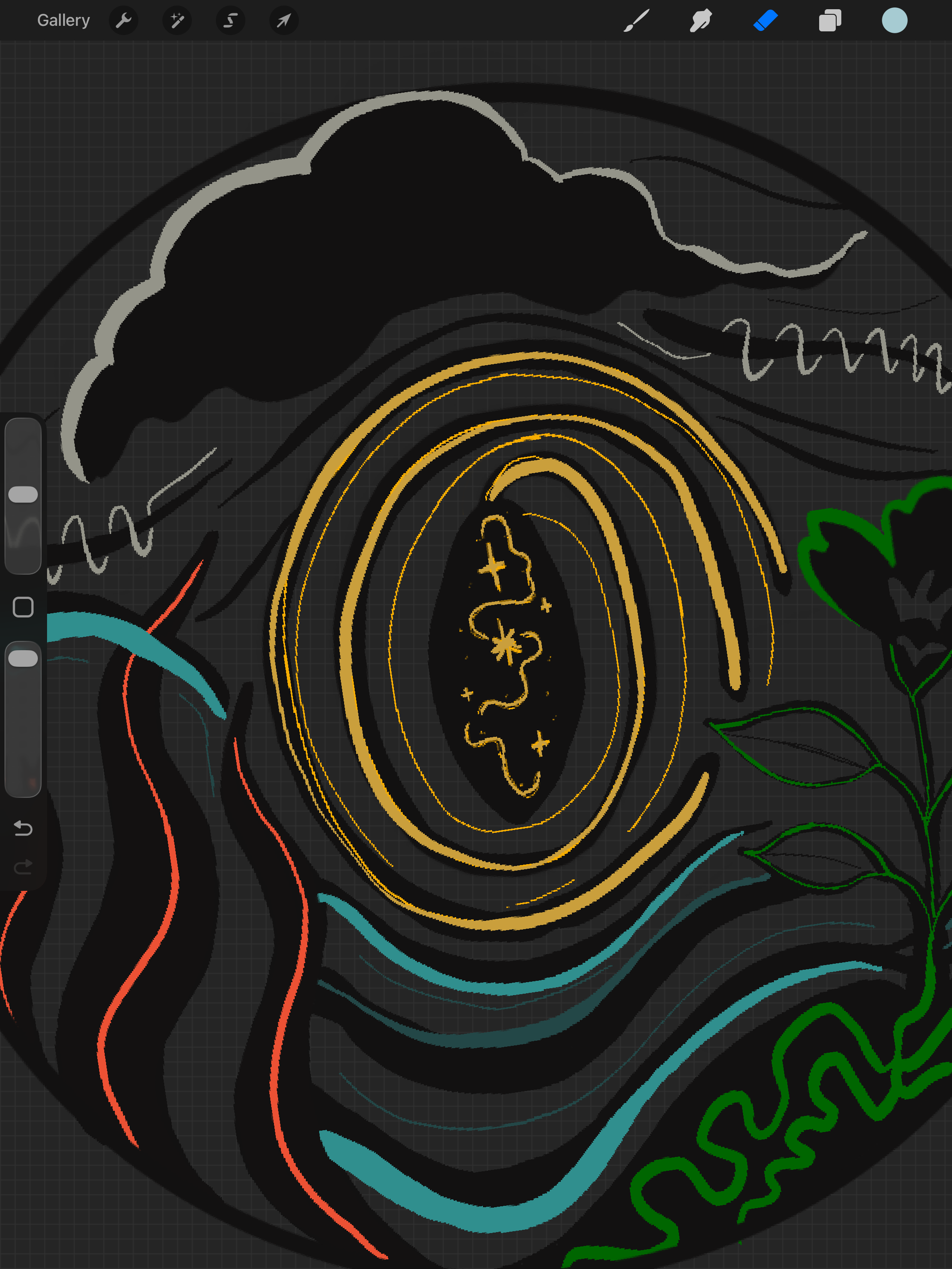
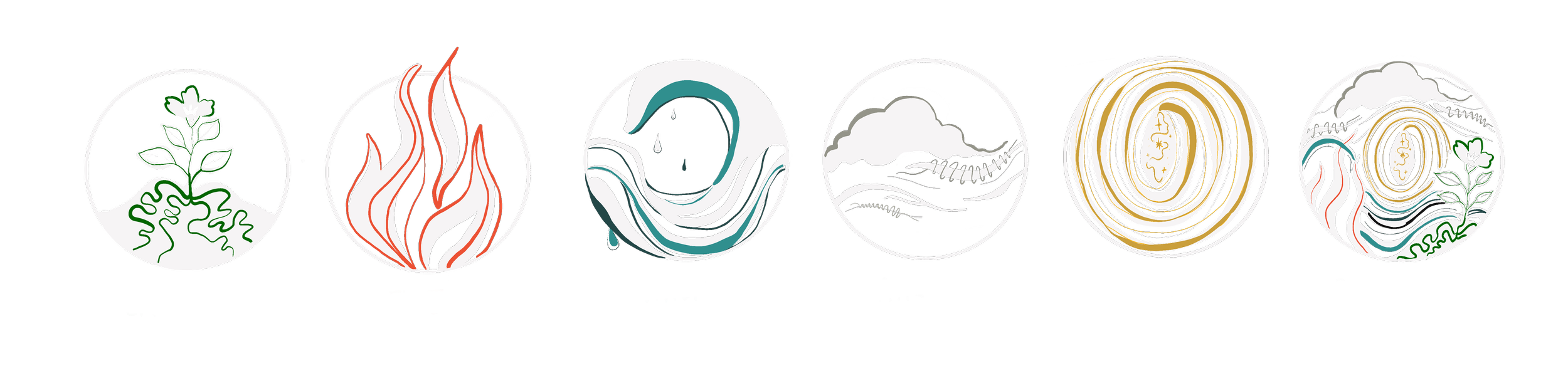
The first color pass helped us figure out what was working and what needed to shift. We pulled back on the solid color and let black and white do more of the work, using each element’s color as an accent instead.
From there, I refined the linework, weight, and balance of each illustration so they could work individually without losing the feeling of a full set.
The final set
Six illustrations built to stand on their own and still feel unmistakably part of the same world.
Finding their place
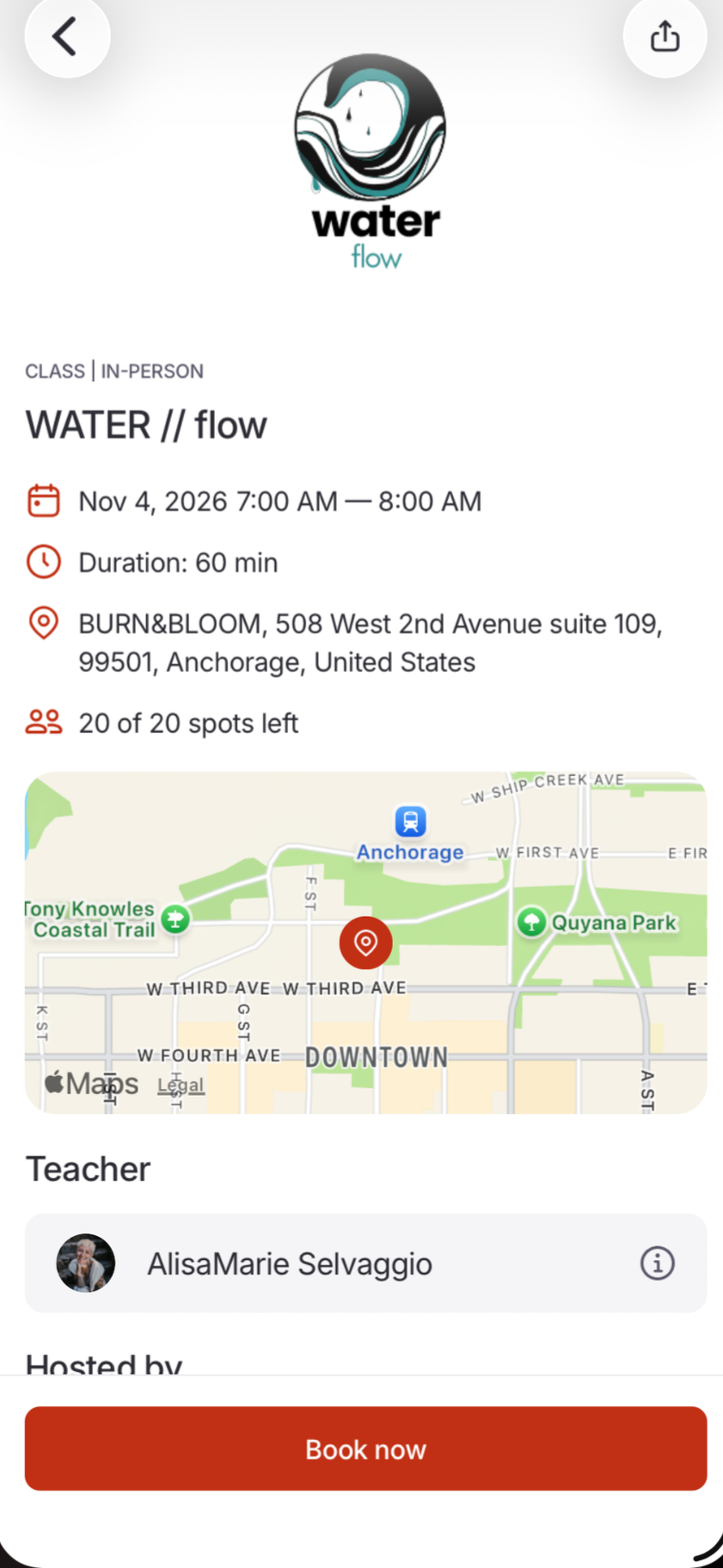
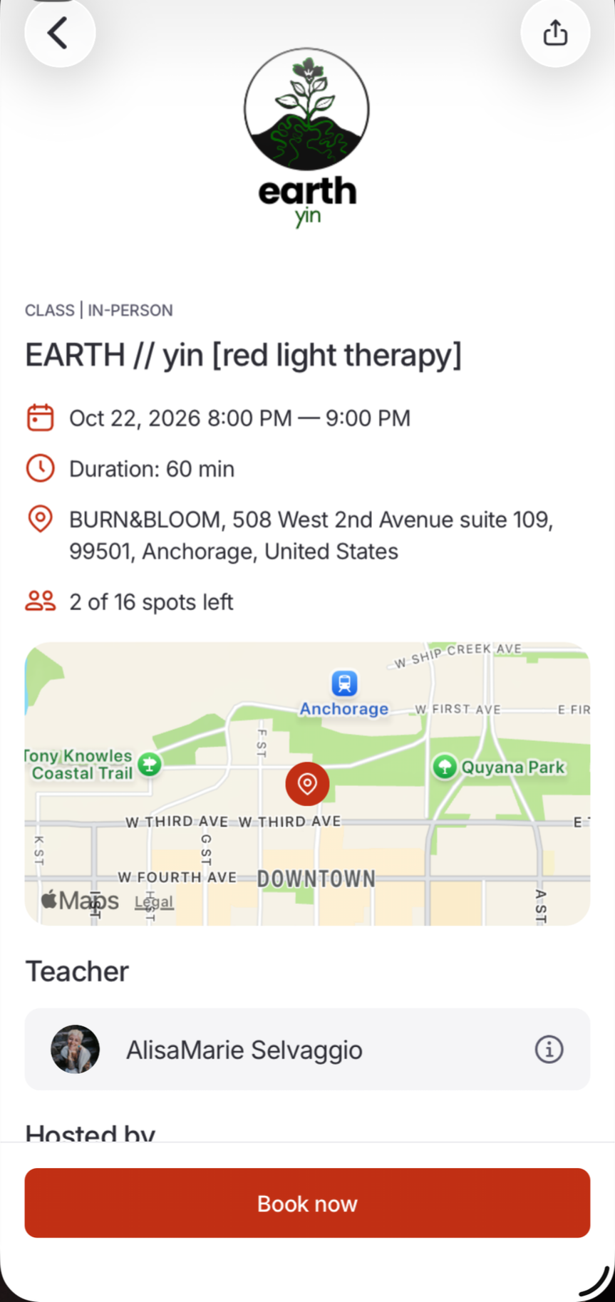
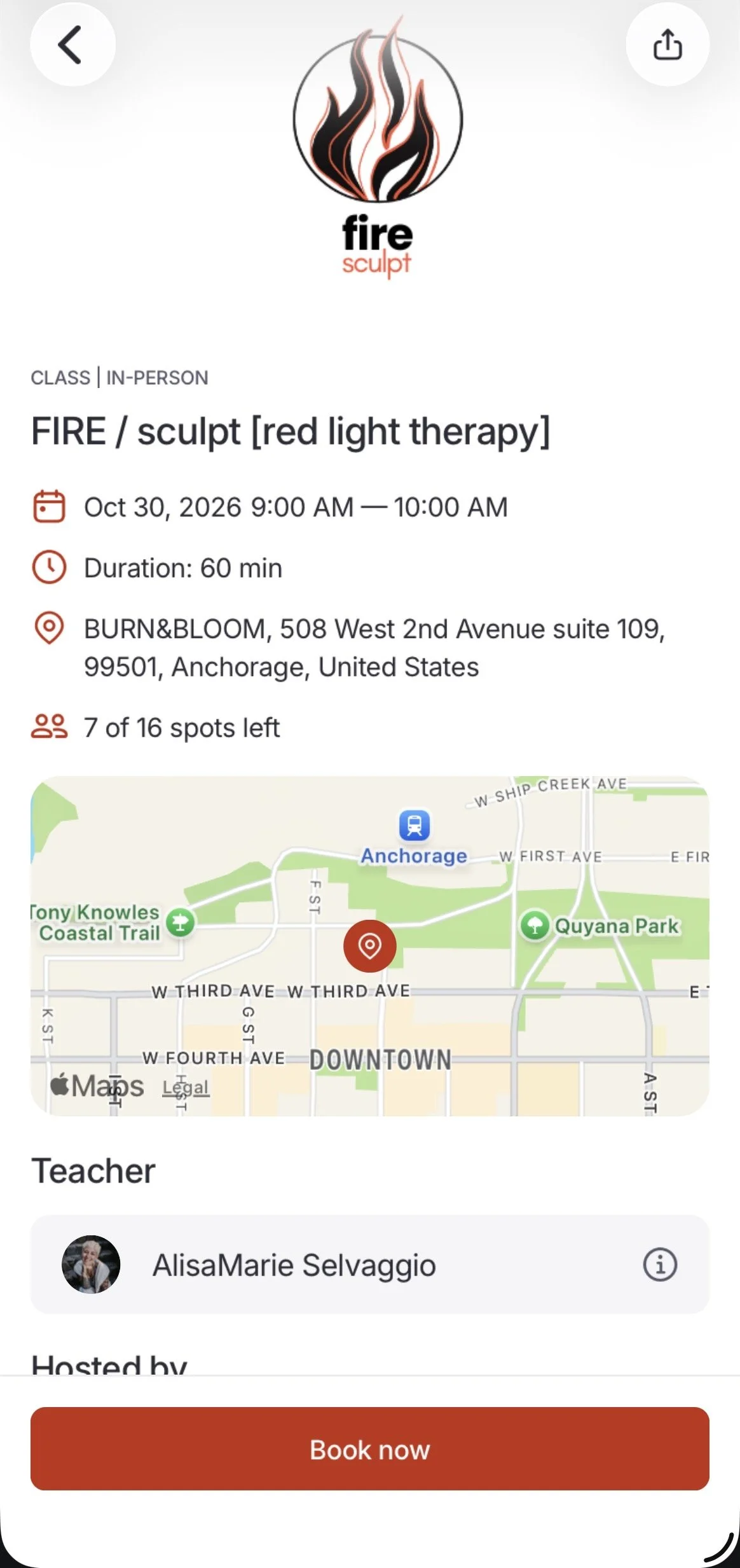
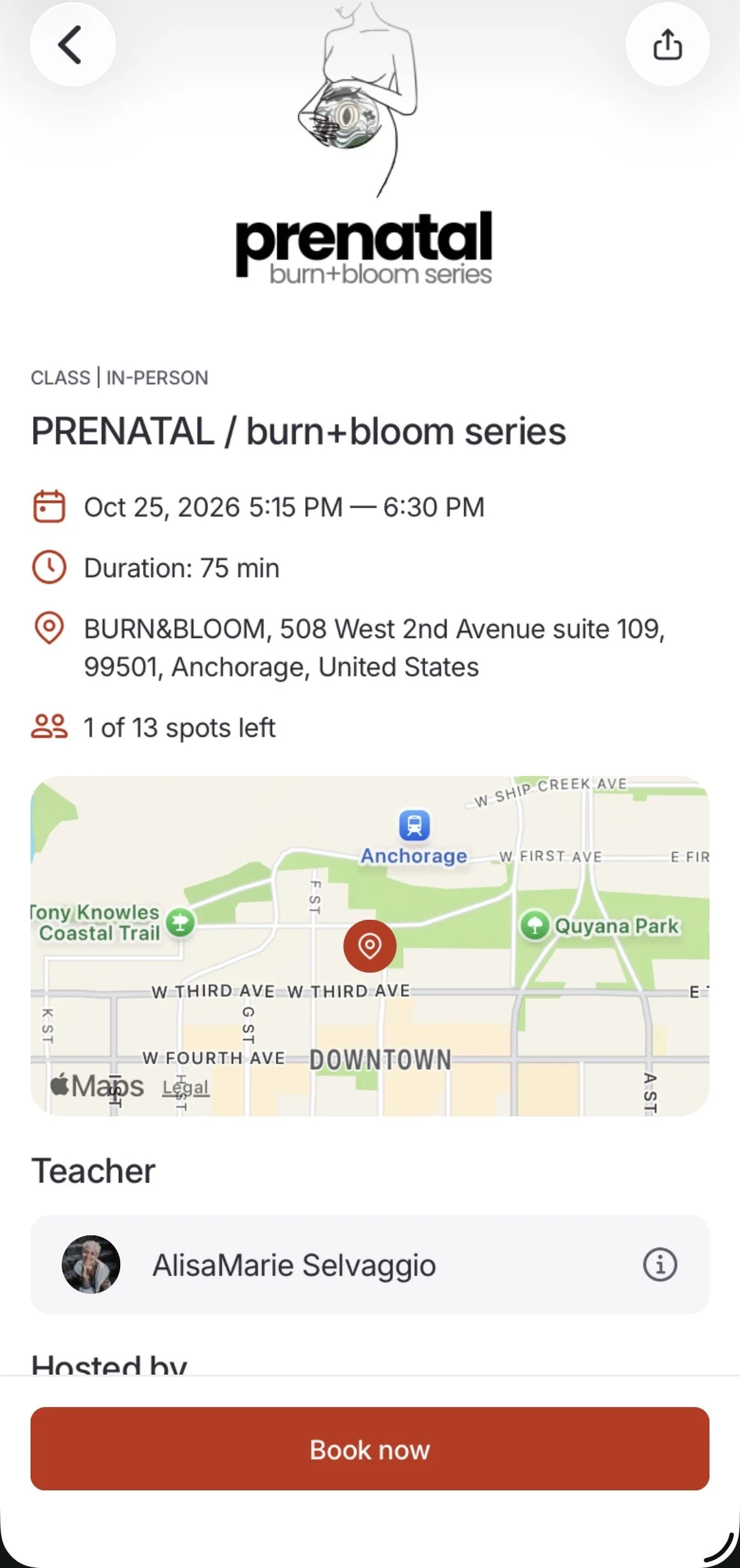
The elements are starting to find their place within Burn + Bloom. First in the app and classes, with more to come as they’re worked into the studio