Kao Lee Lee Real Estate
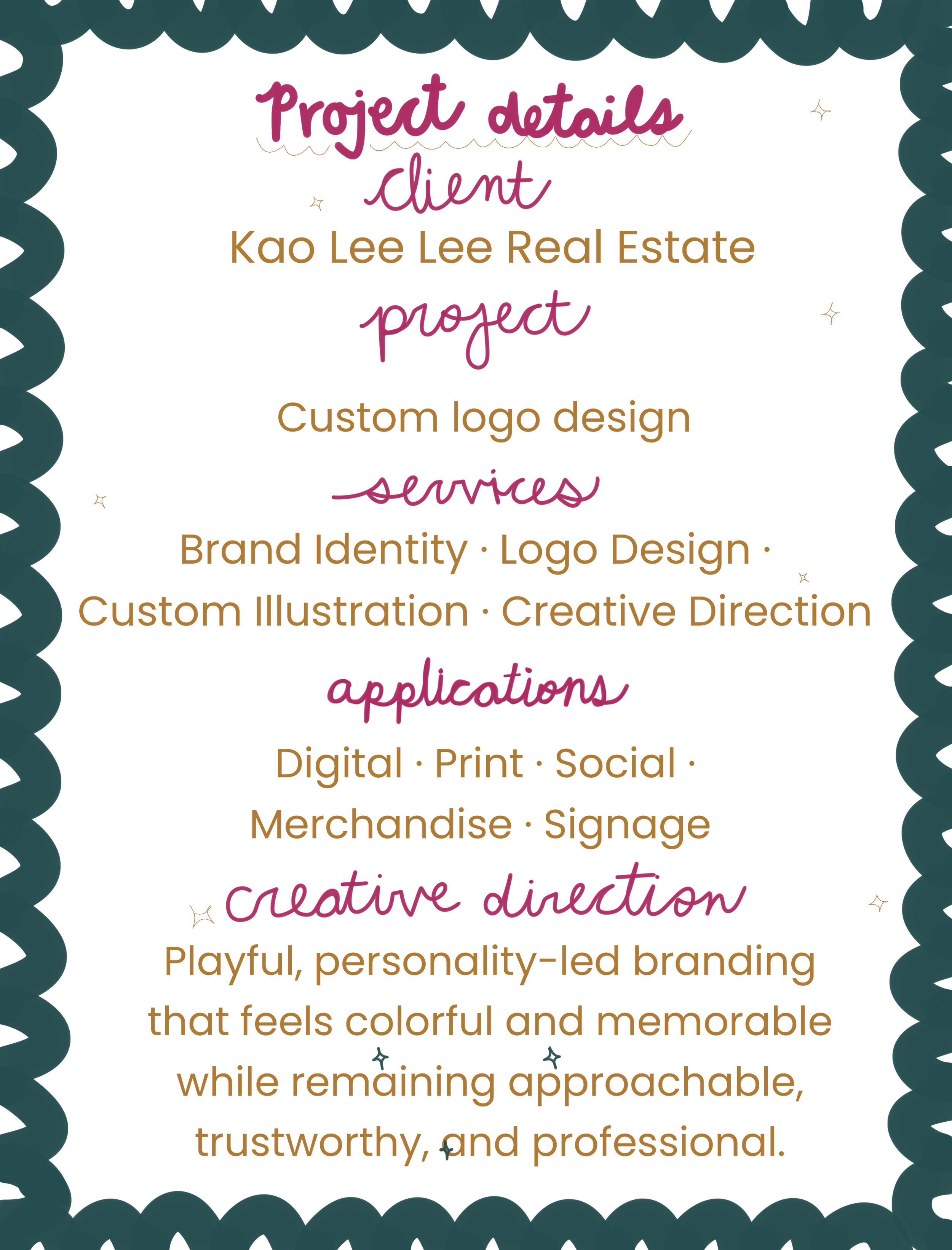
A custom logo design
Where it began
Kao was stepping into a new chapter as a full-time realtor and wanted a brand that felt more like her. With a background in education, her approach to real estate is rooted in helping people feel informed, supported, and confident throughout the process. She wanted an identity that could carry that trust and professionalism while still feeling colorful, approachable, and full of personality.

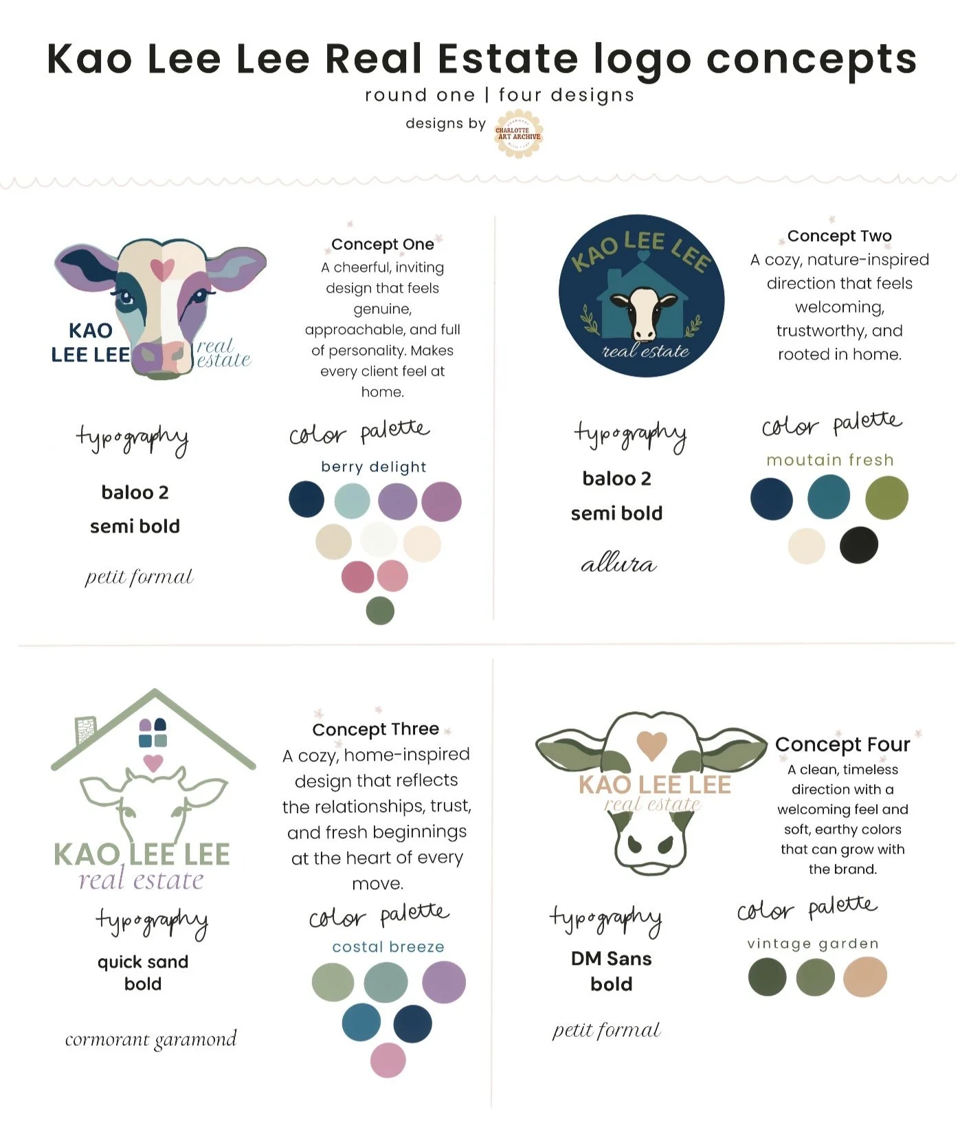
The logos Kao Lee came to me with
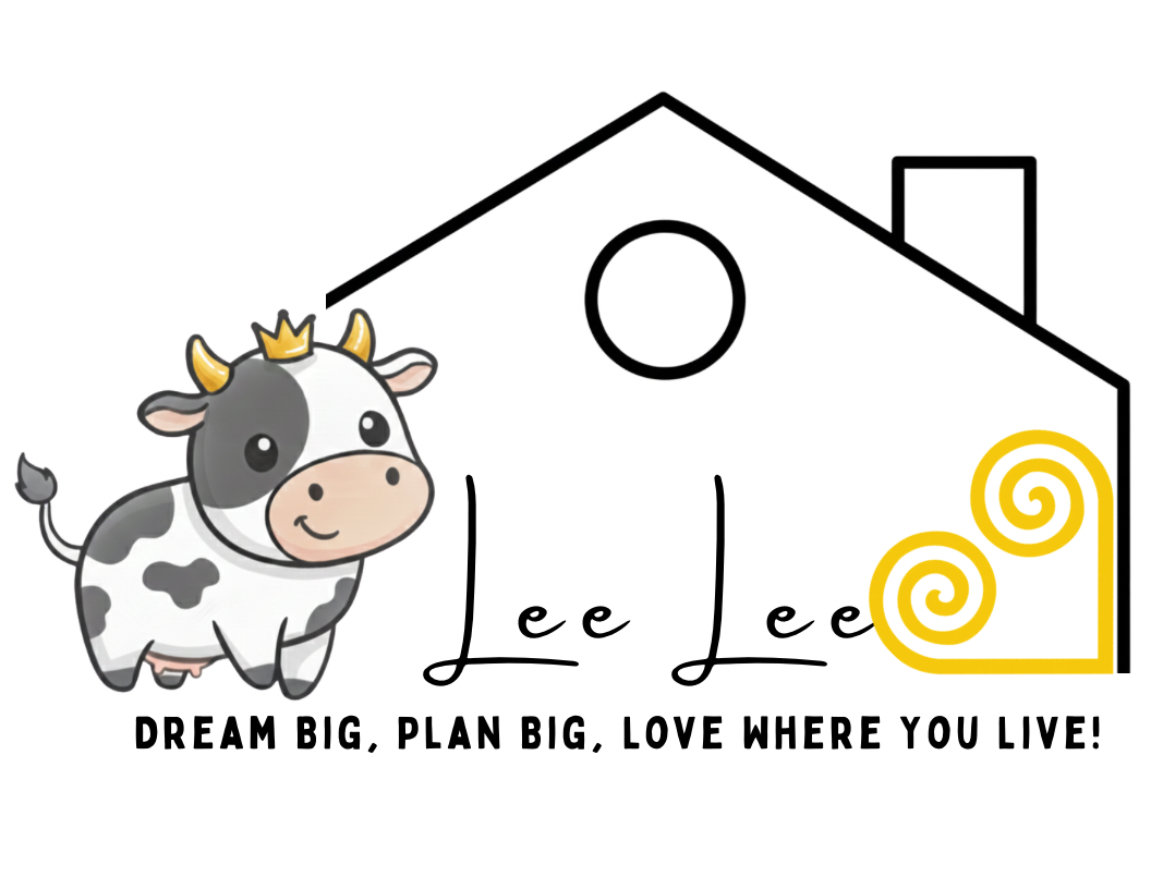
The challenge was creating something that felt professional and trustworthy without blending into traditional real estate branding. Kao wanted her personality to come through—bold, colorful, adventurous, and warm—while still creating an identity her clients could immediately feel confident in.
The challenge
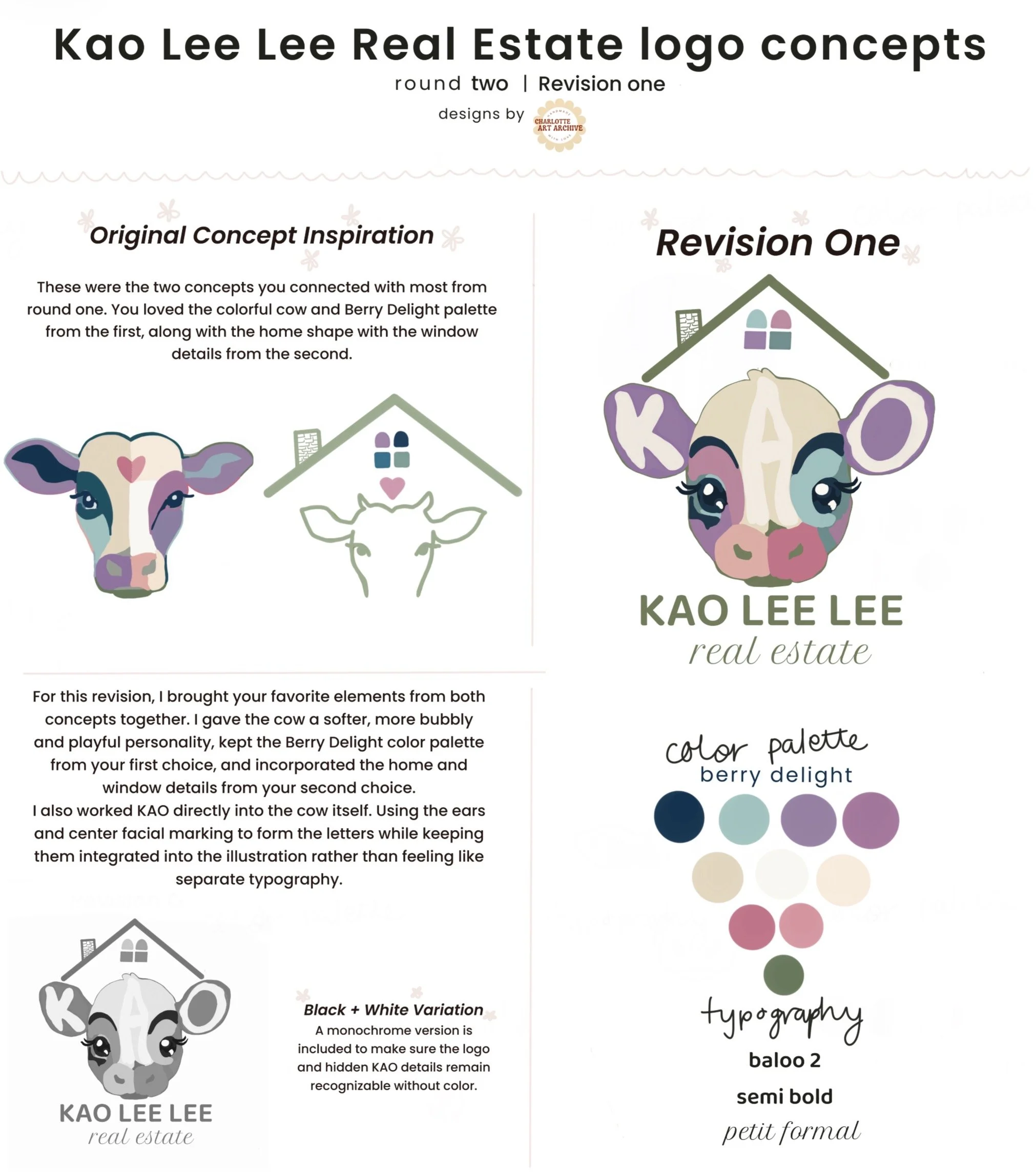
As the direction became more playful, the cow evolved from a traditional illustrated mark into a softer, more expressive character. The hidden KAO detail remained part of the design while the character gained the warmth and personality that ultimately shaped the final identity.
Building the direction
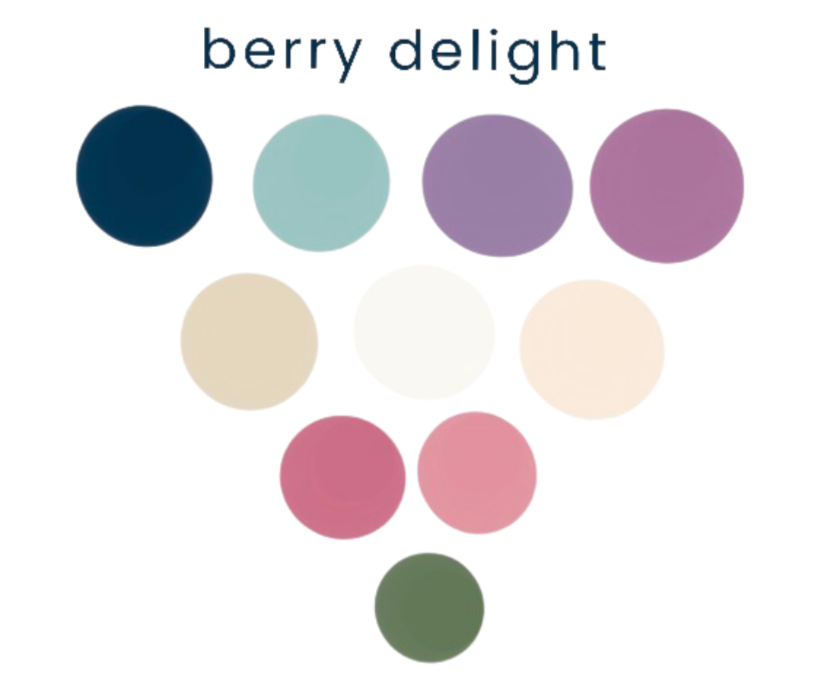
Color palette created for this project
Developing a character
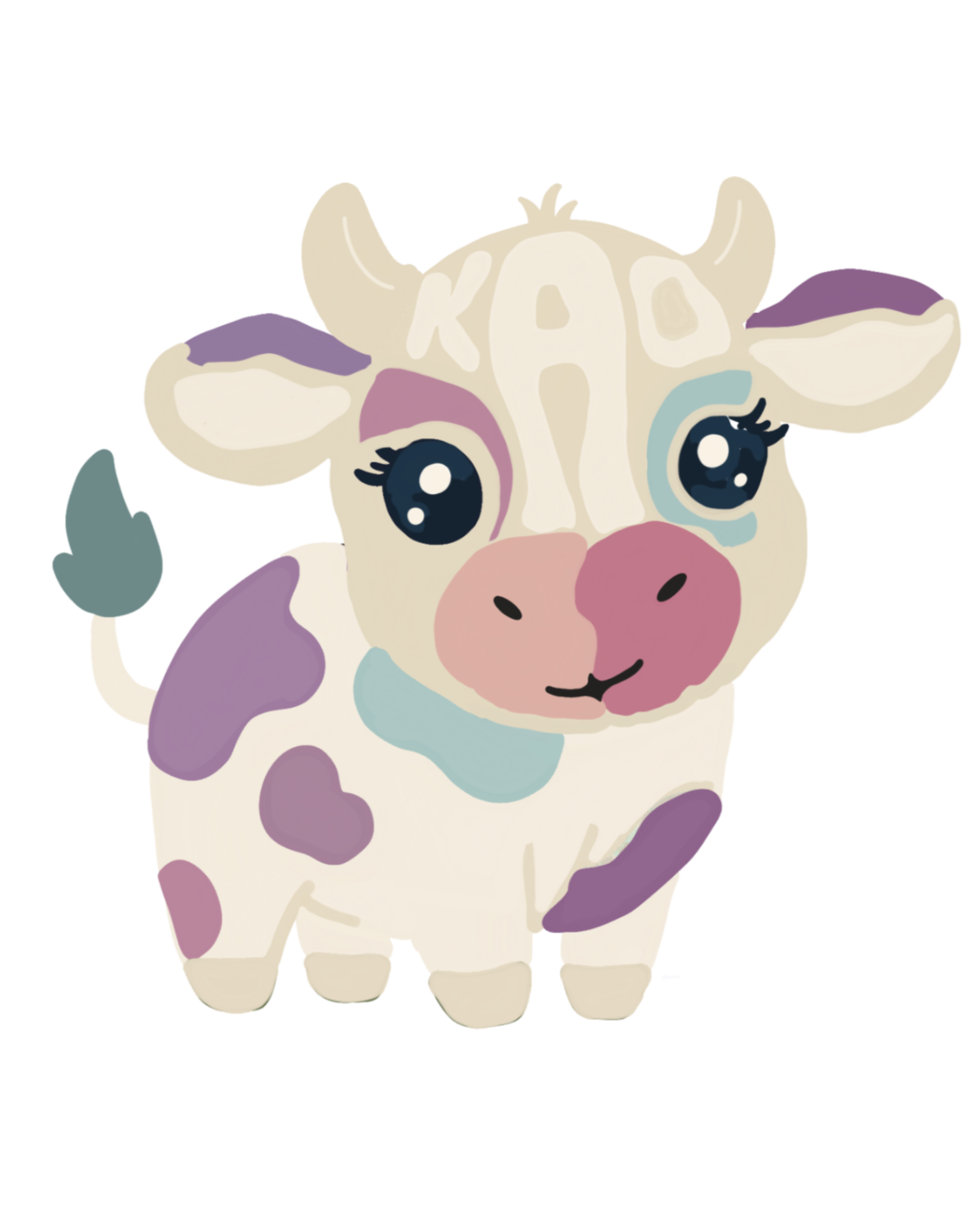
One element Kao knew she wanted to keep was the cow—a playful connection to the “Kao” in her name. From there, I began exploring how the character, home imagery, color, and typography could work together as one recognizable identity.
Final identity
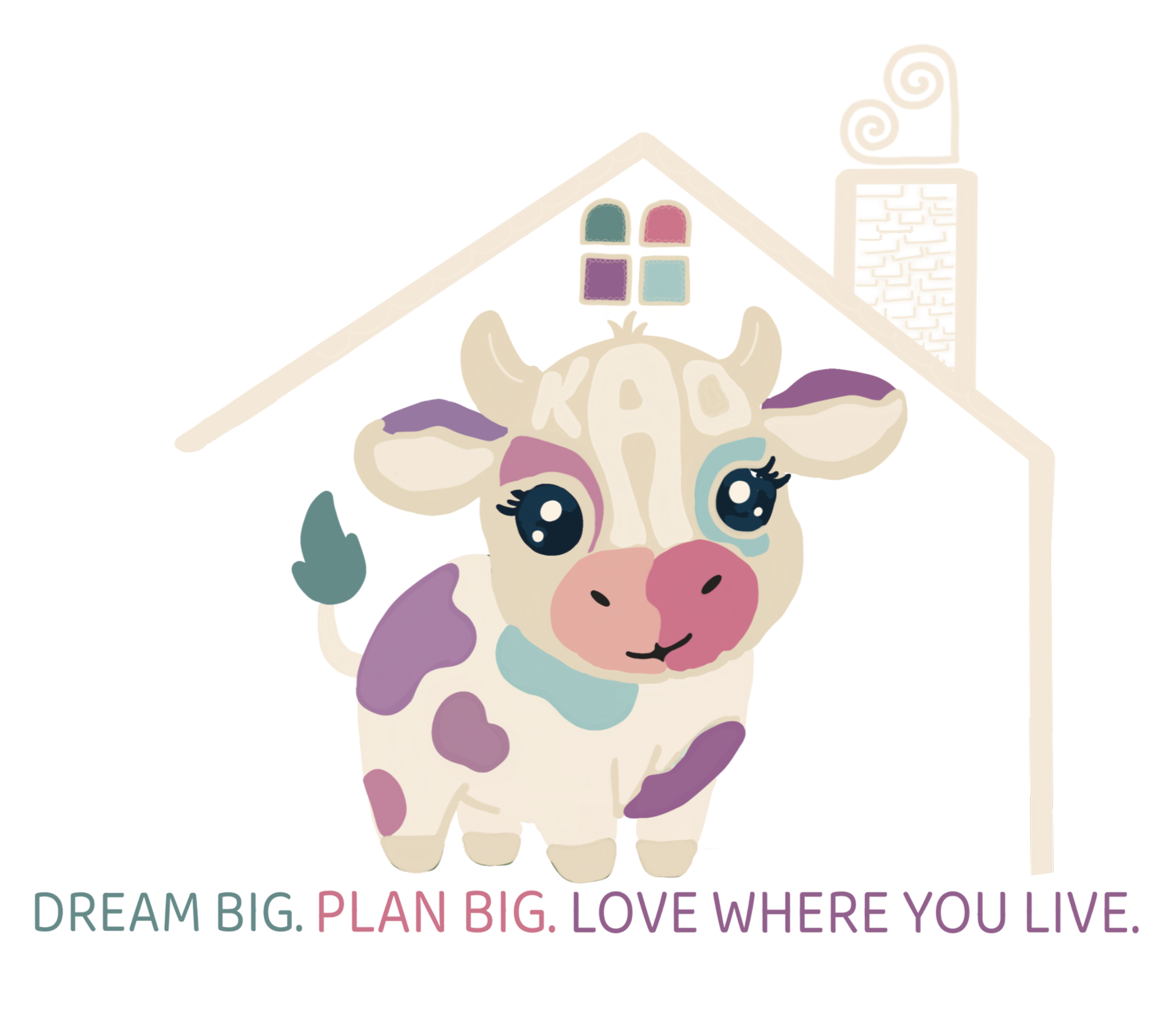
The final logo brings together Kao Lee’s personality, love of color, and the feeling of home in a way that still feels welcoming and professional. It feels personal to her, memorable, and ready to grow with her as she steps into this next chapter of her real estate career.
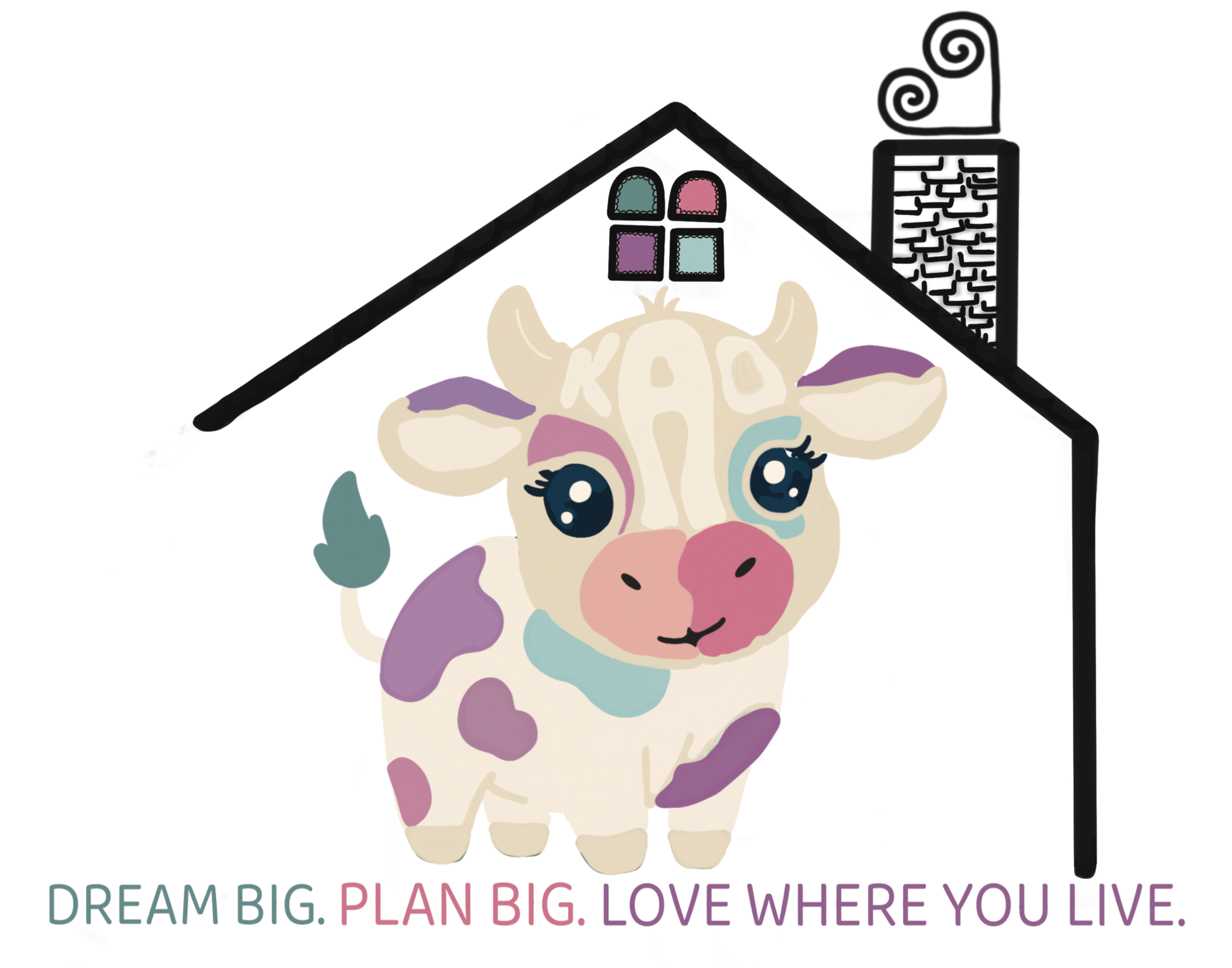
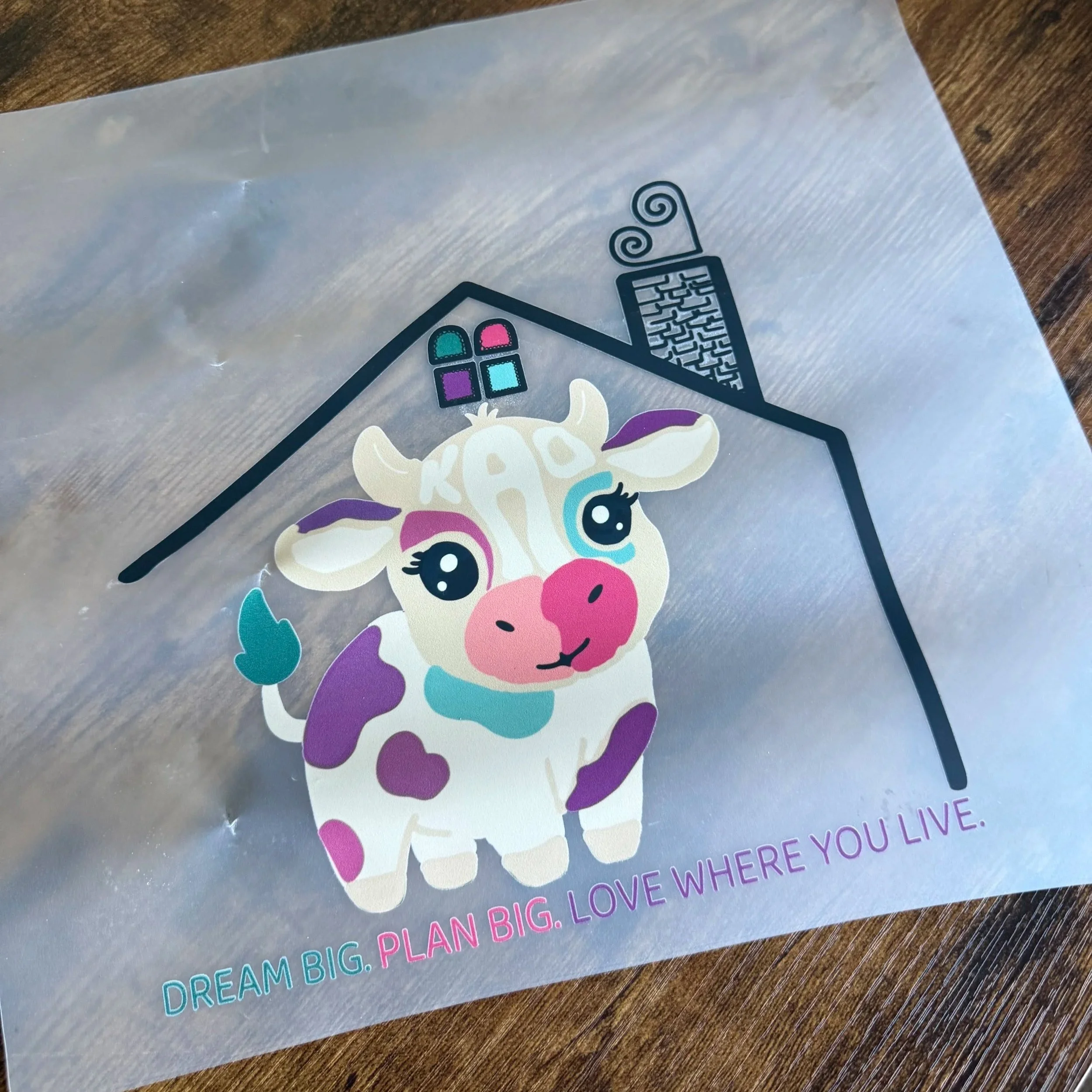
cream outline + black outline variations requested by Kao Lee for various printing options
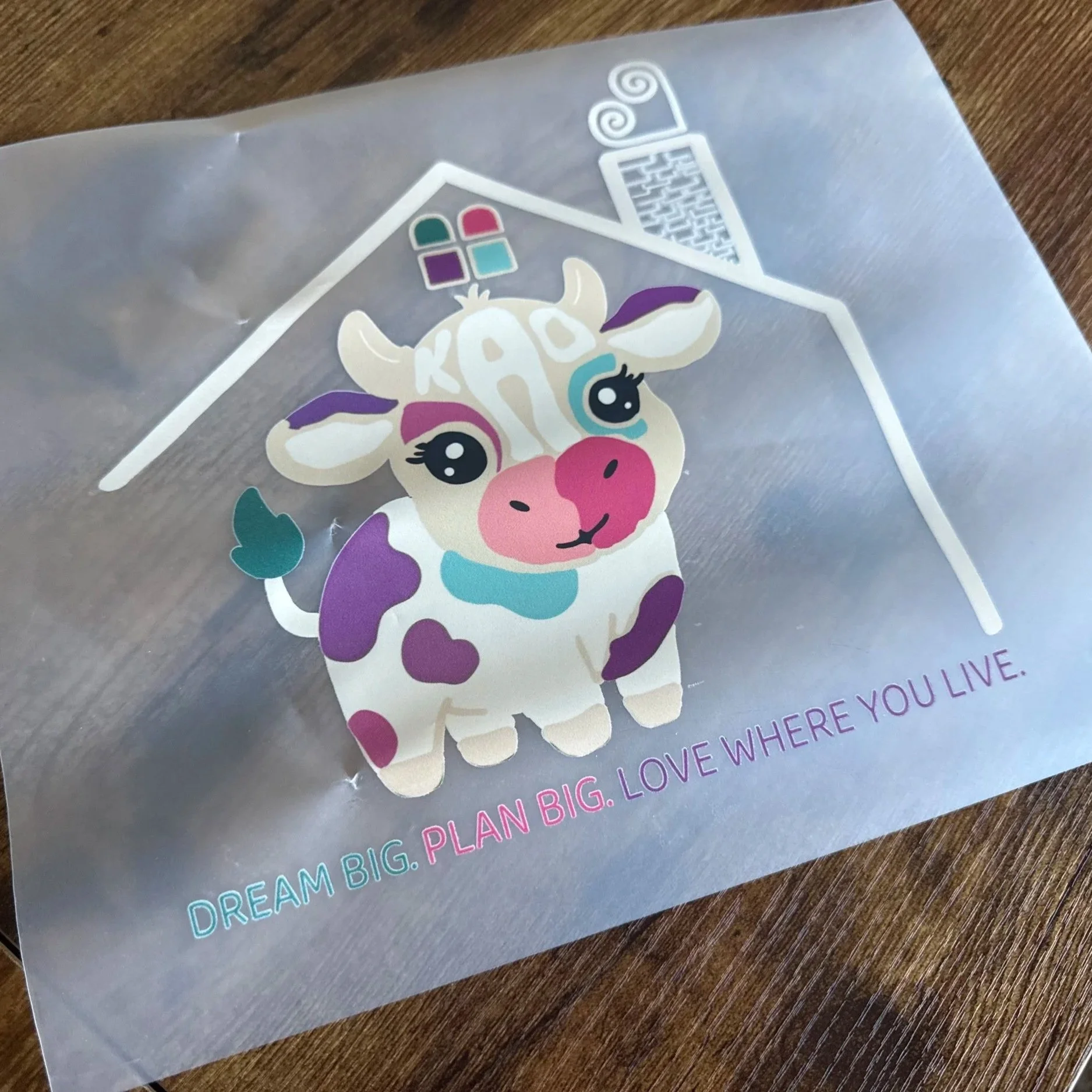
Logo preparing to go out in the world