Sour Sisters Lemonade— A branding refresh

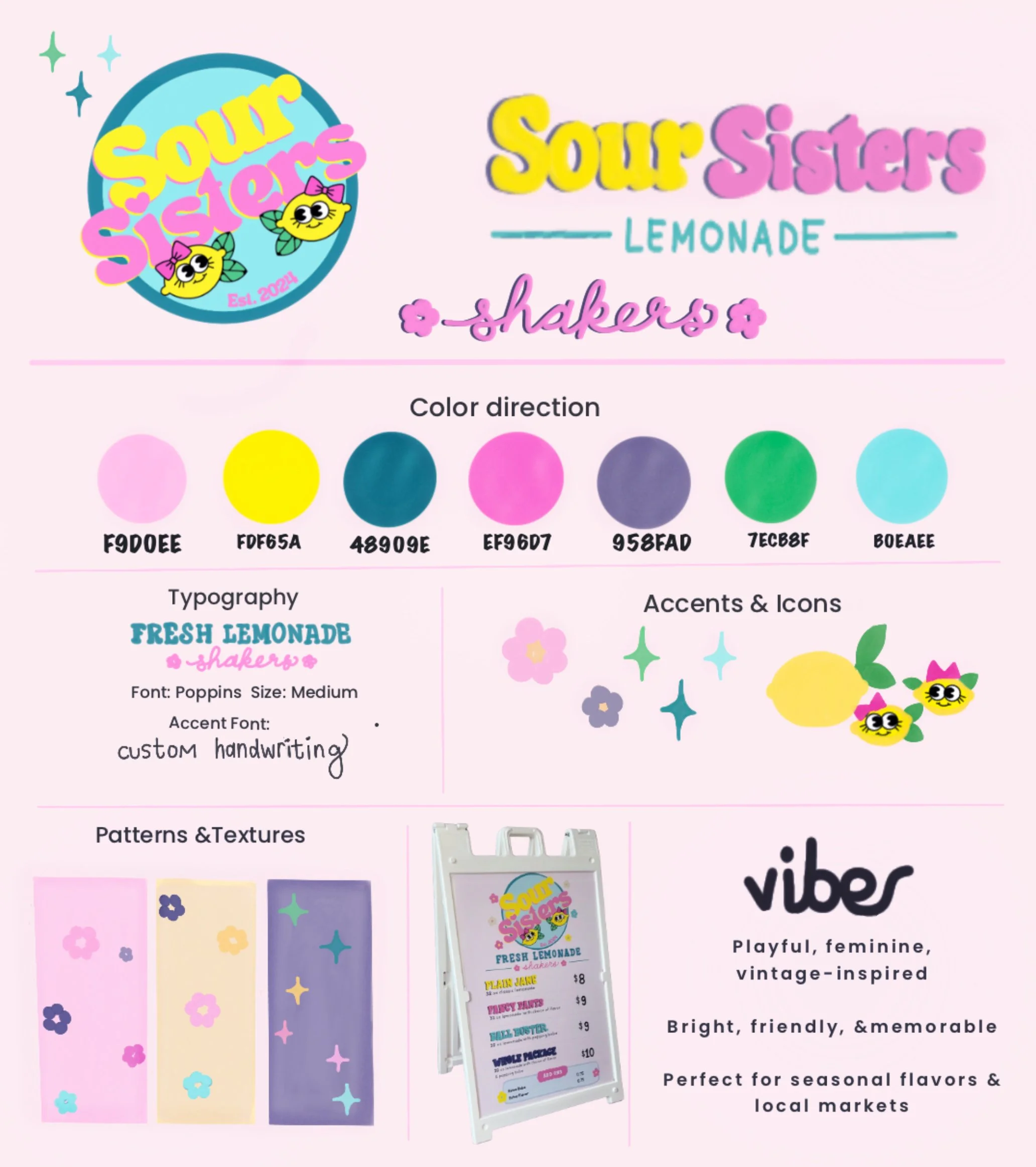
Updated Brand Direction
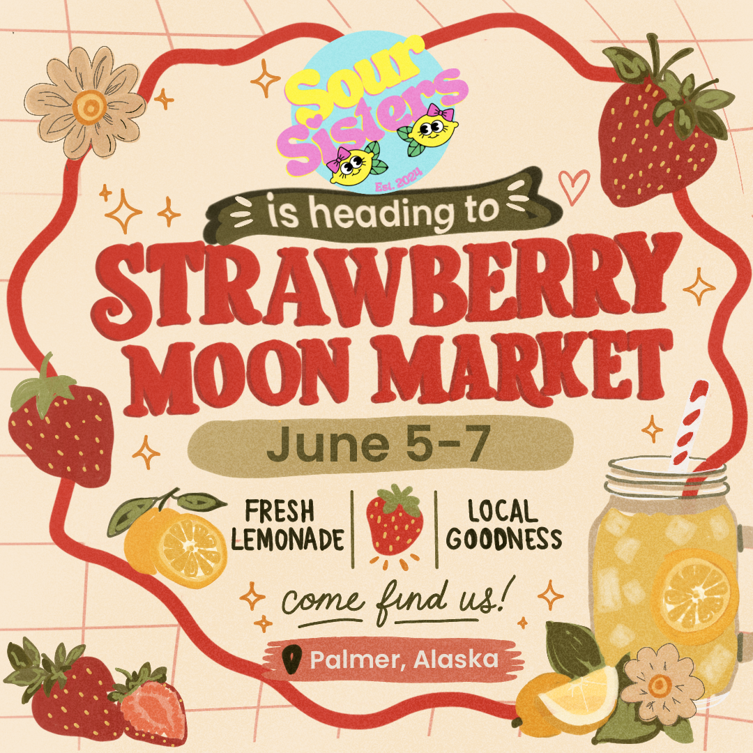
A vibrant, 60s-inspired branding refresh for a seasonal lemonade business, focused on creating cohesive visuals across signage, menus, and product touchpoints for in-person markets and events.
The Goal
The goal was to create a cohesive, playful brand that would stand out in busy market environments while feeling fresh, recognizable, and easy to expand seasonally.
Brand direction + color palette refinement;
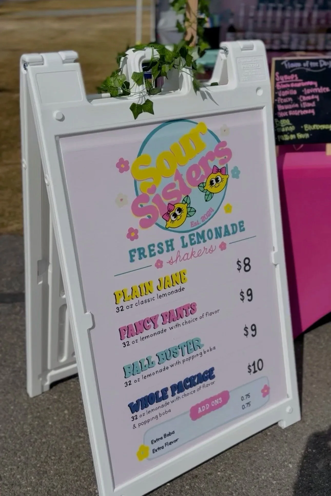
Menu design + layout
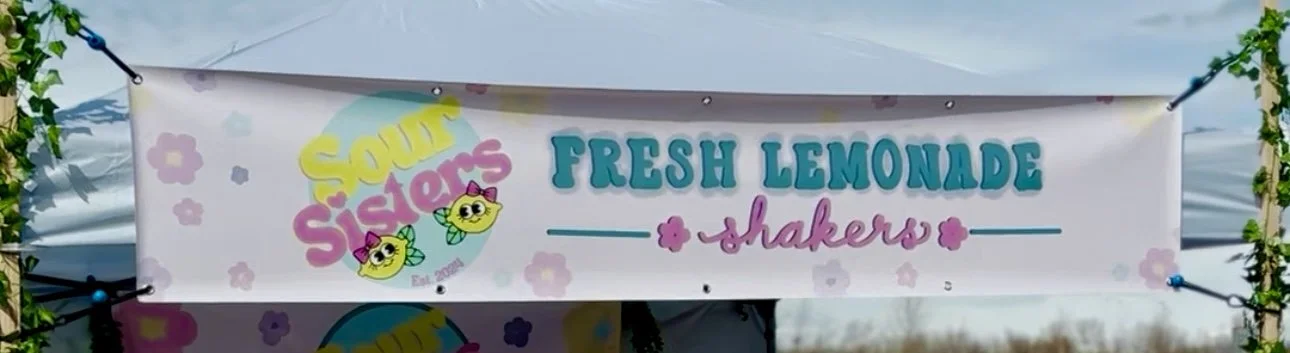
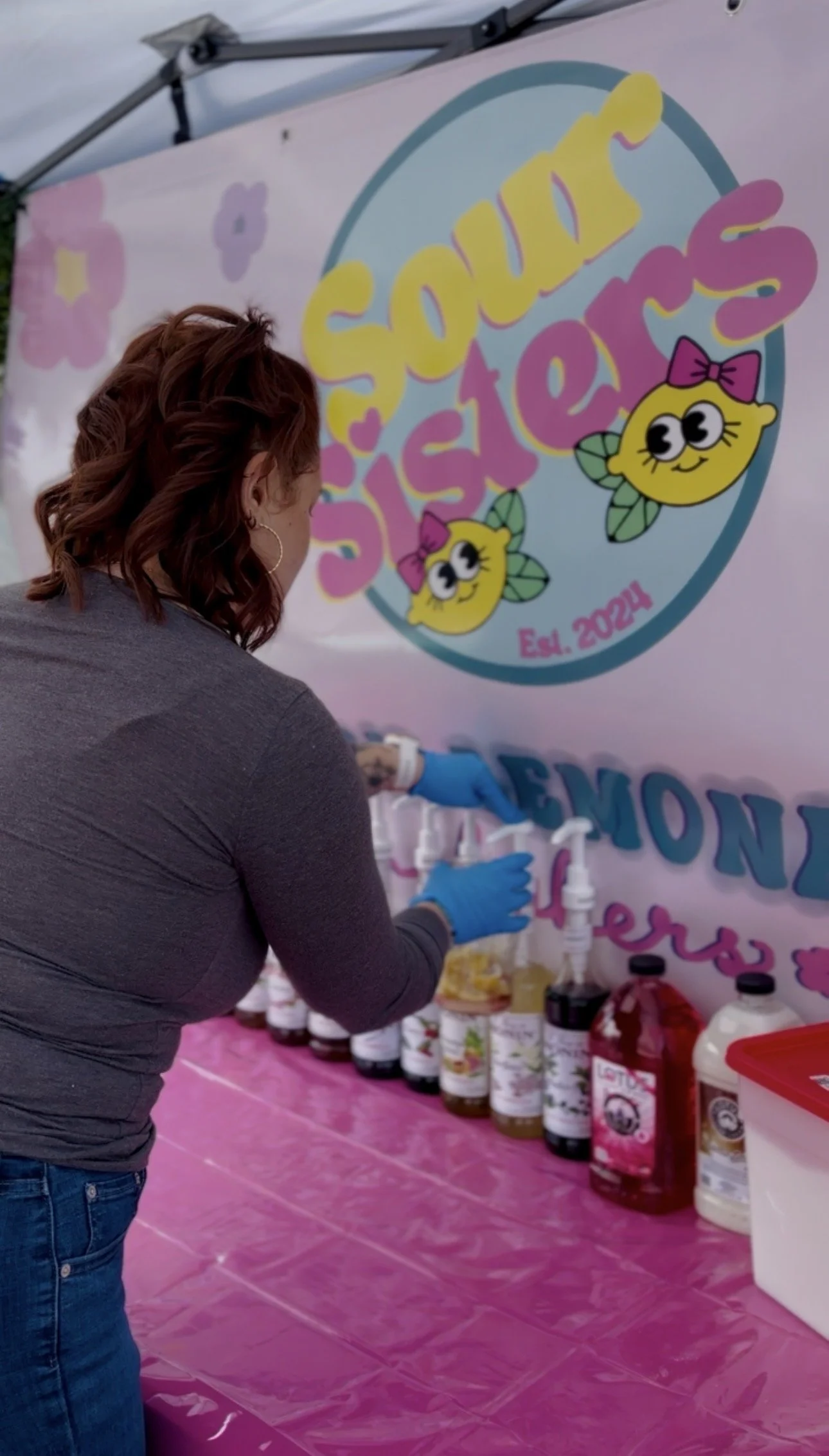
Large-scale signage (A-frame + banners)
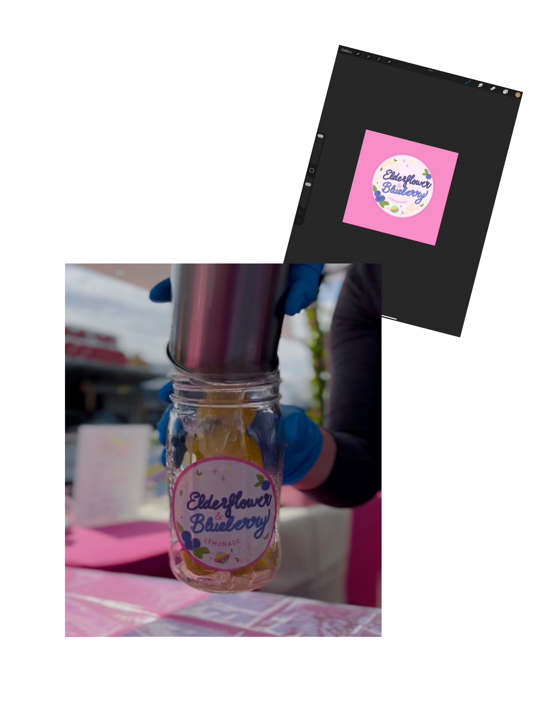
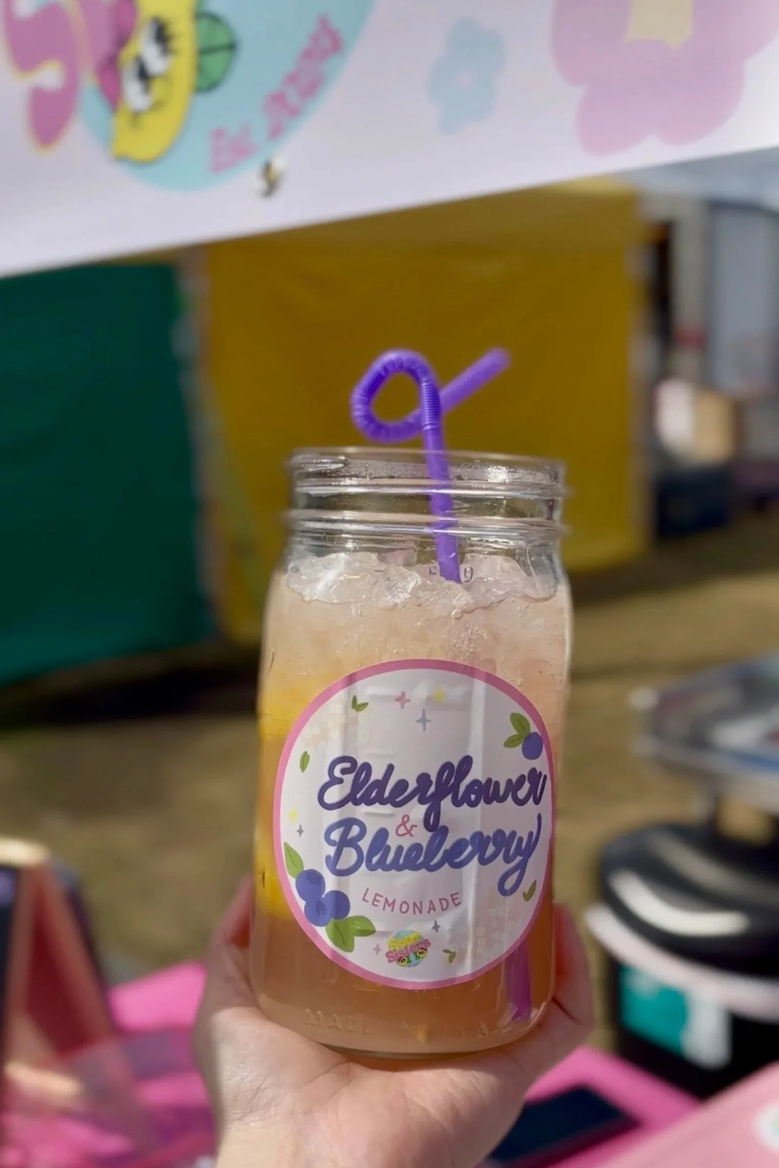
Product stickers + seasonal designs
Visual cohesion across in-person and printed materials
Scope Of Work
Designs in the wild
Deliverables included:
signage
menus
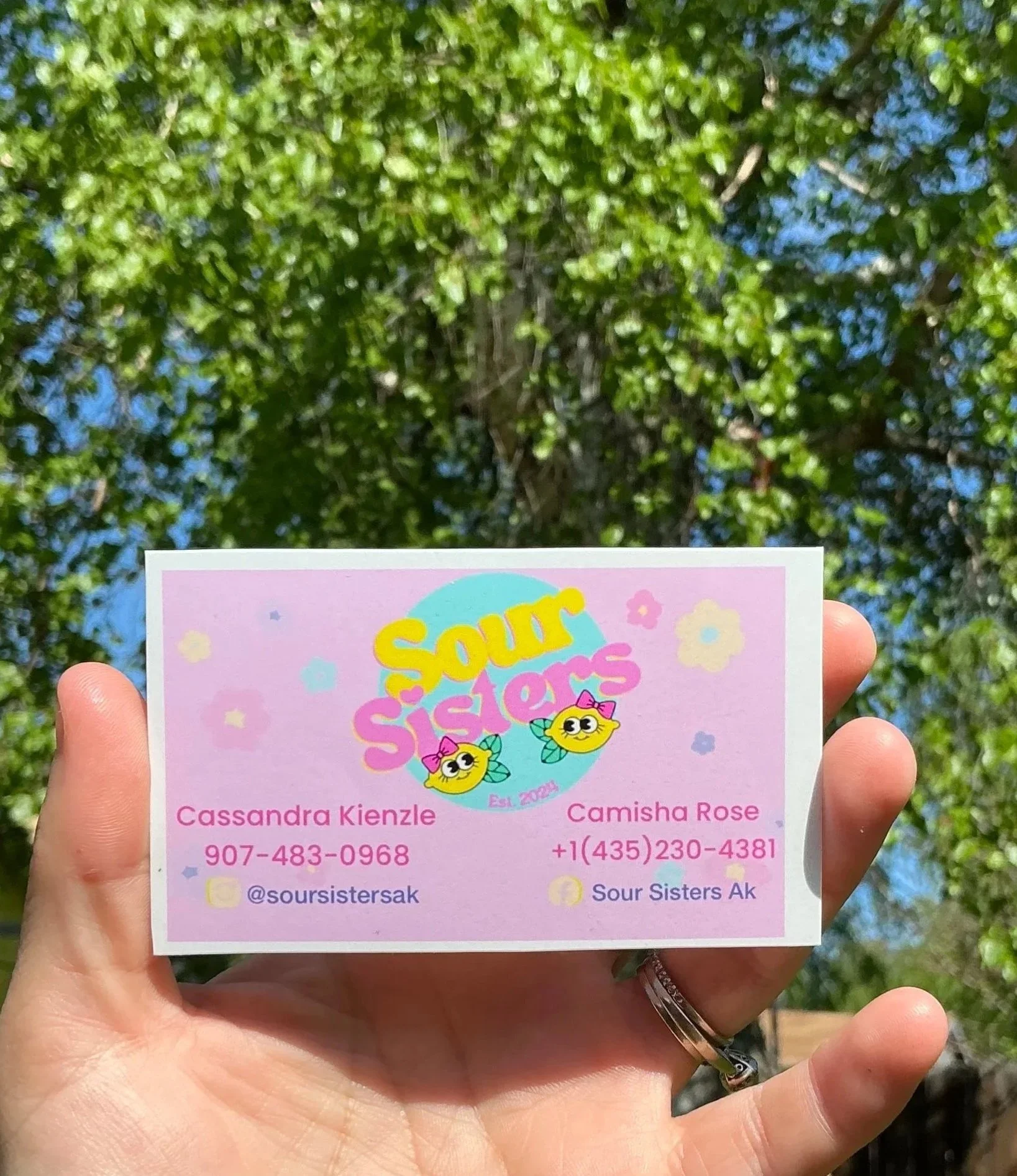
Business cards
stickers
event graphics
seasonal campaigns
This project laid the foundation for a flexible, evolving brand that can grow with seasonal offerings and future expansion.
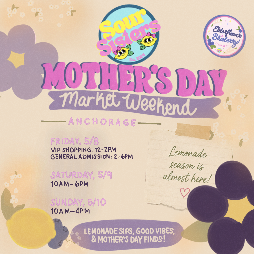
Mother’s Day Market Collection
For the Mother’s Day market season, the visual direction expanded into a softer, more floral variation of the Sour Sisters brand while still maintaining the playful retro energy of the core identity. This seasonal collection included specialty drink stickers, coordinated social }media graphics, and market-focused promotional materials designed to feel cohesive, celebratory, and visually engaging for in-person events.
The goal was to create a seasonal extension of the brand that felt fresh and collectible while remaining instantly recognizable within the existing Sour Sisters visual identity.